Friday, July 29, 2011

EconomPics of the... Since the Last Time

It's been a long while since an EconomPic recap, so here goes...


Asset Classes

Economic Data

Random

And the EconomPic video of the week... a sick rendition of a great song. ThePETEBOX with a cover of the Pixies Where is My Mind?

  • Turning Japanese


    I've recommended Steve Keen's piece The Roving Cavaliers of Credit before, but I highly recommend it for those that think inflation remains a concern.

    Source: BEA

    Rewind: On the Value of Treasuries

    As ten year yields re-approach 2.7% levels, let us revisit (i.e. pat myself on the back for) a post from last September when yields were 2.7%.


    On the Value of Treasuries - September 7th, 2010

    In recent weeks, a number of investors I respect have commented that Treasuries are rich and should be avoided (or even outright shorted). Recent examples include Doug Kass and James Montier, both of whom claim current yields put too much weight on expectations of a double dip. I simply don't agree...

    While I am not a Treasury bull, it is my view that at a 2.7% yield Treasury bonds are fairly valued when one takes into account the low growth / low inflation outlook, the Fed's extended easing policy, and the potential for capital appreciation rolling down the steep yield curve. Below we'll take a look at these three points in more detail.


    Point #1) Nominal Growth Matters

    This point was first shown in the following chart a few weeks ago.


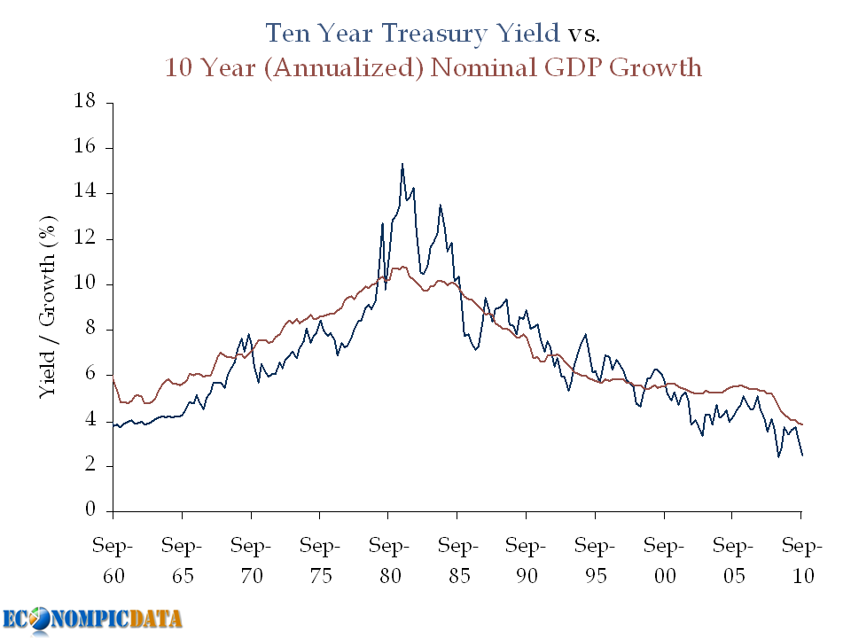
    In Doug's post he compares historical real GDP to Treasury yields and notes that bonds should be yielding more (he notes that Treasuries have historically yielded ~360 bps more than real GDP). The problem with this analysis outside of an apples (real GDP) to oranges (nominal Treasury yield) approach, is that a large portion of this "spread" was due to the inflation spike seen in the chart above during the late 1970's / early 1980's; a period marked by high nominal Treasury yields and low real GDP.


    Point #2) The Importance of Monetary Easing Policy


    A bond investor that does not take duration risk can only earn VERY low rates over the next few years as long as the Fed is on hold. If an investor earns VERY low rates for each of the next two years, they will need to earn a much higher return for the remaining 8 years just to break-even with the Treasury investment. The key is that the market is pricing this in.

    Example:

    Assuming a "zero" interest policy for two years (by zero, lets assume 0.25%), this means that a 2.7% yield can be achieved as follows:

    • The first 2 years at 0.25%
    • The last 8 years at 3.32%
    The formula: (1 + 2.7%)^10 / (1 + .25%)^2 = 1.29878^(1/8) = 3.32%
    The chart:


    The relevance? The market is not forecasting rates will stay as low as they are now (i.e. forward rates are higher... closer to that 3.32% rate than 2.71%), which means capital losses will not happen simply if rates rise from current levels, but rather rise above levels expected by the market going forward.


    Point #3) Don't Forget the Rolldown


    The yield curve is VERY steep (i.e. upward sloping). This means that the 10 year bond will not only return its yield over the next 12 months if nothing changes (i.e. if the yield curve is exactly where it is today in 12 months), it will return more.

    How much more?

    Using current figures, the 10 year Treasury is yielding 2.71% while the 9 year Treasury is yielding 2.54% (17 bps difference). Assuming that nothing changes, performance of a 10 year bond over the next 12 months will be made up of the 2.71% yield plus the capital appreciation from moving from a required yield of 2.71% to 2.54% (i.e. a bond with a 2.71% coupon and a required yield of 2.54% will be worth more than par). This specific 17 bp move would add an additional 1.5% (assuming a duration of 8.75 years on a ten year Treasury) over the next 12 months, which means a 4.2% return for the 10 year note if nothing changes.


    Source: Federal Reserve / BEA

    U.S. Economy Firing on No Cyclinders

    As Calculated Risk points out:

    Not only has growth slowed, but the recession was significantly worse than earlier estimates suggested. Real GDP is still not back to the pre-recession peak.
    The chart below shows the rolling three year average contributions by consumption, investment, government, and net exports... all of which combine for a real GDP lower than the level seen three years ago.


    Source: BEA

    Q2 GDP... Where's the Consumer?

    Bloomberg details:

    Real gross domestic product -- the output of goods and services produced by labor and property located in the United States -- increased at an annual rate of 1.3 percent in the second quarter of 2011, (that is, from the first quarter to the second quarter), according to the "advance" estimate released by the Bureau of Economic Analysis. In the first quarter, real GDP increased 0.4 percent.

    The acceleration in real GDP in the second quarter primarily reflected a deceleration in imports, an upturn in federal government spending, and an acceleration in nonresidential fixed investment that were partly offset by a sharp deceleration in personal consumption expenditures.


    Source: BEA

    Wednesday, July 27, 2011

    With a Treasury Closer to Default....

    The only ETF on the daily screen I run from time to time in positive territory... Treasuries!


    Tuesday, July 26, 2011

    Buying Options

    The U.S. may or may not default on its debt (I am going with the not), may or may not be downgraded (I think it is likely within the next 12 months), and may or may not be a completely dysfunctional mess in Washington (okay, this is a definite). In times like this, I would like optionality (calls and puts) even if it were expensive.

    But, lo and behold... the VIX is currently priced below its 5, 10 and 20 year average.


    Which is why I am buying options....

    Friday, July 22, 2011

    Breaking Down the GLD / SPY Model

    I've been researching and analyzing a number of rotation / momentum strategies of late (details potentially to follow), which is one reason why I was so interested in the recent GLD / SPY Rotation Strategy posted by Michael Gayed over at The Big Picture. In a nutshell the strategy attempts to follow rolling monthly momentum to allocate between gold and the S&P 500. He concludes:

    Of course, past performance is not indicative of future results, but the simple binary decision of being either long SPY or long GLD depending on which is outperforming the others does seem to suggest alpha can be generated.
    While I am not nearly as willing to suggest the framework works (and if it does, it doesn't necessarily work in the manner described), I did think the framework was interesting enough to take a deeper dive.

    First of all, let's outline the strategy:
    • Using end of day values for Gold (ETF GLD) and the S&P 500 (ETF SPY), create a price ratio by dividing GLD by SPY
    • If the ratio is greater than the 20 day moving average of the ratio, then allocate to gold; otherwise to the S&P 500
    I was able to closely match the results:


    What I Like

    Before I dive into the issues I have with the analysis, here is what I like...

    I like that while the strategy was only allocated to gold about 50% of the days, it still tracked the performance of gold with a correlation of .70 on a monthly basis. That is pretty staggering. Why do I like that? Because it opens up the possibility that it closely tracks gold when gold outperforms and may track equities when equities outperform.


    Issues

    That said, here are my main issues with the model:
    • The data set is very limited
    • The data is from a period in which gold significantly outperformed equities
    If you were to have asked me prior to seeing the analysis if I was interested in a model that involved gold and equities that outperformed equities over the past 6 1/2 years, my response would have been a very easy no. Unless the model shorted gold, it would have been just about impossible NOT to outperform equities over that time frame (gold is one of the top performing asset classes since 2004; equities one of the worst).

    As a result, I would have been much more interested in hearing about a model that outperformed gold over this time, rather than consistently underperform over its history (20.7% annualized returns vs. 17.9% annualized returns), without much of a reduction in volatility (21.1% vs. 20.3%).


    Deeper Dive

    Keeping those limitations in mind, lets dive into the idea that gold is a good momentum strategy. The below chart summarizes the performance of the model based on different periods of exhibited "strength" in the model as defined by the level that the GLD / SPY index was above its 20 day moving average and the corresponding one day forward average return in the price of gold and the S&P 500.


    An interesting observation is that the only level that gold did not outperform was when the GLD / SPY index was greater than 10% above the 20 day moving average (note that this was less than 2% of all trading days) and GLD / SPY outperformed most when the GLD / SPY index was more than 10% below the 20 day moving average. This:
    1. Indicates the GLD / SPY index outperformed the S&P 500 because gold in most instances outperformed the S&P 500
    2. The model actually shows gold and S&P 500 exhibit mean reversion at extreme levels

    Update:

    I was able to find Gold prices going back to 1992 (the inception of the SPY) over at USA Gold and recreated the model using Gold rather than GLD. The results don't seem too promising prior to the beginning of the gold rally that started in 2001.


    Monday, July 18, 2011

    Silver is Once Again on a Tear

    Similar to gold (see a past post On the Value of Gold) silver has been on a tear due to low interest rates, fear of inflation, and a declining dollar (actually not similar to gold, but more like in multiples greater than gold). While the price of gold or silver is already a reflection of a weak dollar (i.e. if silver increases in price, it is outperforming the dollar), the relationship between the dollar index (relative to other currencies) and silver since the beginning of the year has been rather striking.


    The warning note to the above is that while this relationship is not new, the scale of the relationship of ~10x since last summer, is (from 2007-mid 2010 it was closer to 2x).


    Perhaps this time is different and we should simply be Ready to Ride the Golden Silver Bubble.

    Source: Yahoo Finance

    Monday, July 11, 2011

    Market Smack-Down

    In the battle of technicals vs fundamentals, on this day fundamentals are winning.


    I just dipped my feet back in the water with some calls on the S&P. While vol has spiked today, a level below 20% considering everything going on in the world seems cheap and indicates the market may prefer to move higher. No way I (personally) would be buying outright here though.

    Source: Yahoo Finance

    Friday, July 8, 2011

    Hours Worked per Person Flatlining

    Hours Worked per Person (Employment to Population Ratio x the Average Work Week of Private Workers), shows the sluggish rebound in "labor usage" relative to the population.


    The concern... for the last 25 years there has been a very strong relationship between hours worked per person and real GDP growth (a decent relationship prior to 1986, but with a lot more noise), but notice the huge gap since the "recovery" began.


    Unless "this time is different" there are two possibilities:
    • The Good: Employment will follow (it just needs an unprecedented amount of time)
    • The Bad: The economy is outperforming due to all the government support / transfer payments, the impact of which will be fading going forward
    Source: BEA / BLS

    Is Education Over-Rated?

    This data would indicate it is not...


    Source: BLS

    No Good News in Employment Report

    The LA Times reports:

    Analysts had raised their job-growth forecasts for June to 100,000 or more in recent days, hopeful of a rebound after surprisingly few job gains in May, which many attributed to temporary factors such as Japan's earthquake and the spike in oil prices.

    But, in fact, the growth of 54,000 jobs previously reported for May was revised down Friday to just 25,000. And the nation's payrolls followed that with a barely perceptible 18,000 new net jobs last month.

    Friday’s jobs report was remarkable in that there was nothing positive in it. Manufacturing, instead of bouncing back up as many had expected, added a meager 6,000 jobs. Hiring in construction remained dismal. The once-fast-growing temporary-help industry shed jobs for the third month in a row. And budget-strapped government offices eliminated an additional 39,000 jobs from their payrolls. Services remained weak.

    Even for those with jobs in June, there was bad news. The average weekly work hours declined by 0.1 to 34.3. And the average hourly earnings for all private-sector employees dropped by one cent to $22.99.
    Things are even worse if you look at the Household survey (the survey used to determine the unemployment rate), where more than 440,000 jobs were lost during the month as individuals are flying out of the workforce. That figure takes into account the 59,000 teenagers finding jobs (not exactly the high paying jobs).


    Source: BLS

    Thursday, July 7, 2011

    ADP Employment Better than Expected

    CNN details:

    Payroll processing company ADP said private jobs grew rapidly in June -- a figure that was much higher than expected and more than four times higher than the prior month. May's figures were downwardly revised to 36,000 jobs. Economists were expecting a gain of just 60,000 private sector jobs, according to consensus estimates from Briefing.com. Smaller businesses led the charge in June. Small businesses, defined as those with fewer than 50 workers, added 88,000 jobs in June. Medium-size businesses, defined as those with between 50 and 499 workers, gained 59,000.
    Don't get me wrong, a better figure is good news, but let's put this in perspective.


    Source: ADP

    Wednesday, July 6, 2011

    ISM Employment Improving... But Lacking Snap Back

    As we wait for the ADP employment figure this morning (not sure why its delayed), below is a chart summarizing the ISM Manufacturing and Services employment indices with the total number employed.


    Source: BLS / ISM

    Friday, July 1, 2011

    Equity Valuation Based on GDP Growth

    An update (with a small addition) of a post from May 2010


    Step 1) Take the S&P 500 Index (lots of data here) and divide that level by the current level of nominal GDP (you can find that here).

    Below is a chart of just that going back to 1951 and the corresponding 60 year average.


    Step 2)

    Fair Value Methodology: Take that 60 year average (8.25%) to normalize the first year of your 'Fair Value S&P 500' "FV" Index by taking nominal GDP at the starting date (in this case June 1951 = $336.6 billion) and multiplying by the percent (x 8.25% = 27.77). In this case 27.77 = the FV Index level (or the starting value normalized).

    Matched Starting Value Methodology: Simply start the index at the value of the S&P 500 as of June 1951 = 21.55.

    Step 3) Using that 27.77 (or calculated value using a different time frame) as the FV Index starting value or 21.55 as the matched starting value, at each interval increase the index by the change in nominal GDP (note... in the chart below, I estimated the Q2 GDP at 2.0% annualized). Why nominal GDP? Go here.

    The below chart shows these calculated indices vs the actual S&P 500 index.


    Step 4)
    Calculate the percent the S&P 500 Index is over or under valued relative to each calculated index.


    Relationship (returns are annualized)....


    Note 1: under these methodologies, the S&P 500 is currently at or above fair value, still implying a decent ten year forward change in the S&P 500 plus dividends minus inflation.
    Note 2: a change in the starting value of the FV Index would simply shift the x-axis to the right or left (i.e. it would not change the relationship between the two)

    Source: Irrational Exuberance