
The following chart has been floating around for more than a year, supposedly showing investors have not only performed poorly, but even worse than almost any asset class. As Richard Bernstein stated:
The average investor underperformed nearly every asset class. They could have improved performance by simply buying and holding any asset class other than Asian emerging market or Japanese equities.

This post walks through the error and shows how to get to returns that are a more appropriate comparison. The conclusion is that the discrepancy between the geometric time-weighted asset class returns and investor dollar-weighted returns has not been driven by poor investor behavior, but rather by the path of asset class returns. A huge and important distinction.
The blue bars shown in the Richard Bernstein chart are geometric weighted returns (i.e. time weighted returns), which unlike average returns take into account the effects of compounding (a good thing), but do not account for dollar flows.
A quick example....
Let's assume an investor returns 100% in year 1 and is down 50% in year 2. While the average return is 25% / year = (100% - 50%) / 2 = 25%, geometric returns were 0% (as follows):
- Year 1: the $1 turns into $2 (100% return)
- Year 2: the $2 turns into $1 (50% loss)
- The $1 invested at time 0 = $1 at time 2 = 0% geometric return
Investment returns are not independent of each other, so they require a geometric average to represent their mean.As an aside... beware any manager only showing average returns. At a minimum they are reporting returns too high (average returns are always > geometric returns).
THE ISSUE: Geometric Returns vs. Dollar Weighted Return: Comparing Apples to an Orange
Now to the major issue with Richard Bernstein's chart... it contains two different types of return calculations; (1) time weighted geometric average returns for the various asset classes and (2) dollar weighted for investor returns (these two should NEVER be compared).
dailyVest explains dollar-weighted returns (bold and bullet format mine):
In contrast with a time-weighted approach, the dollar-weighted rate of return calculation method does measure the size and timing of cash flows, as well as the investment performance. Thus,To reiterate... dollar weighted returns put more emphasis on recent performance than time weighted returns when market flows are positive. For example, going back to the investor with a 100% return in year 1 and a -50% return in year 2, but this time showing dollar-weighted returns for an investor that dollar cost averages $1 each year:
- Periods in which more monies are invested contribute more heavily to the overall return – hence the term “dollar-weighted”
- In this case, investors are rewarded more for larger investments made during periods of greater price appreciation
- Year 1: the $1 turns into $2 (100% return); the investor then adds another $1 to their $2 investment, so they have $3 total investments heading into year 2
- Year 2: the $3 turns into $1.50 (50% loss)
- The $2 total investment is now worth only $1.50
The Path of Returns Over the 20-year Period Mattered
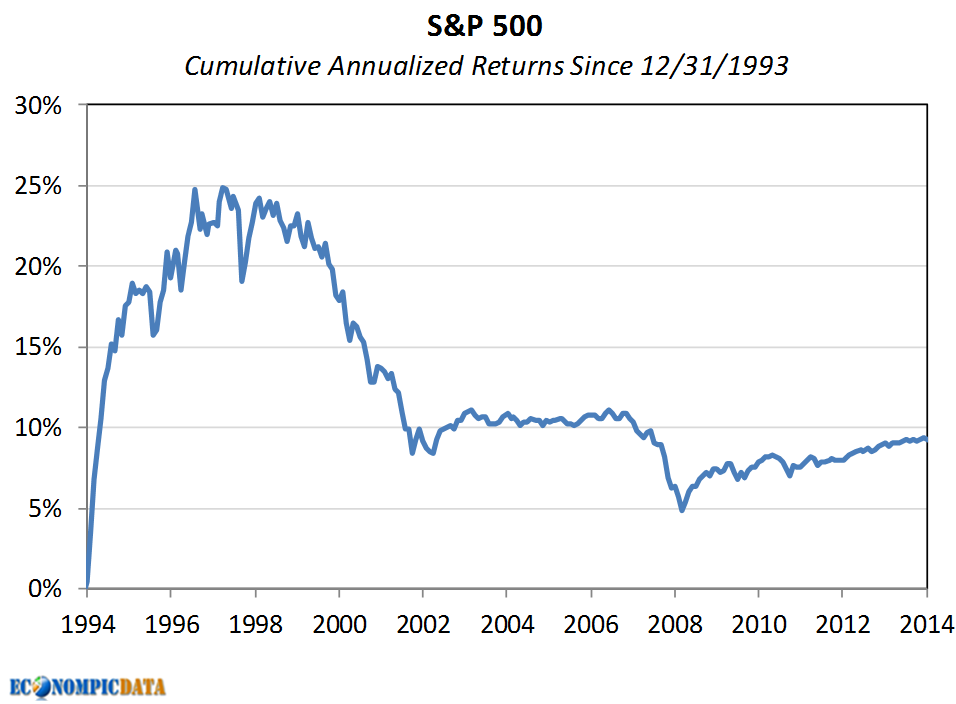
Returns were MUCH higher at the beginning of the 20-year period ending 12/31/2013 than the end due to (1) the 1990's equity bubble and (2) two material drawdowns that took place between 2000 and 2009. The chart below shows annualized geometric returns of the S&P 500 at various points in time using 12/31/1993 as the starting point for all those periods. For example, as of 1998, the annualized geometric returns of the S&P 500 from 12/31/1993 through 1998 was almost 25% annualized. By comparison, by the end of 2013 the S&P 500 returned ~9% annualized from 12/31/1993 - 12/31/2013 (as shown in Richard Bernstein's chart and below).
Dollar-Weighted Returns Have Been Similar to Investor Returns
Since dollar weighted returns put more emphasis on recent performance, we would EXPECT dollar-weighted returns to be lower. For the 20-year period ending 12/31/2013, the S&P 500's geometric returns were 9% annualized, while dollar weighted returns (assuming the same amount investment each month from 1993-2013) were a full 4% lower. Again, this 4% discrepancy assumes completely unemotional dollar cost averaging and is another 1% lower if you assume the contribution rate grew by the rate of inflation over that time frame. Performance dispersion for asset classes where recent performance has been relatively worse (think developed international and emerging markets), was further amplified by the time-weighted / dollar-weighted comparison.

This does work both ways; the chart above was recreated below using data from June 2007 through April 2015, a period when equity returns were much HIGHER in the more recent portion of that time frame.

As a result, dollar-weighted equity returns have actually been higher than geometric returns and my guess is that investor performance would appear "much improved" vs the original Richard Bernstein piece. This, despite what has likely been a period highlighted by poor investment behavior through and since the crisis.

No comments:
Post a Comment